Tried to activate an American Express credit card, via the American Express Android app today. Turned into a field study of assholedesign. I wonder if anyone from their customer service team, or their developers ever tried to follow the sign-up flow themselves.
Issue #1 - Secret rules
The fields the user needs to fill out, has no guidance on what qualifies as a valid input. I put in a username, and a password I deemed safe to use.
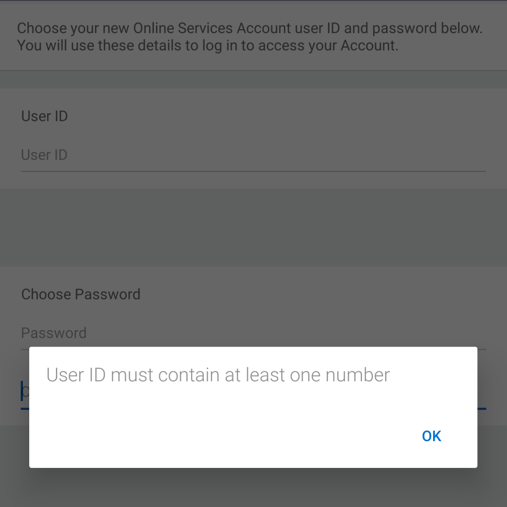
The app told me the following:

"User ID must contain at least one number."
Ok. I add a number to my login and that worked. It wasn't clear I had to from the beginning.
Issue #2 - More secret rules
I then type in a password. It's 11 characters long, and includes one number, and one special character. That mix usually works.
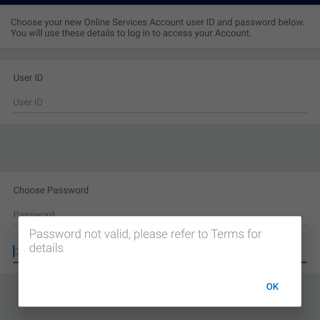
The app tells me:

"Password not valid, please refer to Terms for details."
What's wrong with writing the requirements in the error message or, and I know or it sounds a bit crazy, right next to the field you need to fill it into (like the Norman Nielsen Group has told us since 2015). At least they could have included a link to the "Terms" where these sacred details can be found. Anyway, I ended up getting a generated one from KeePass, but I still don't know what they rules are for their password.
Issue #3 - Dark design pattern
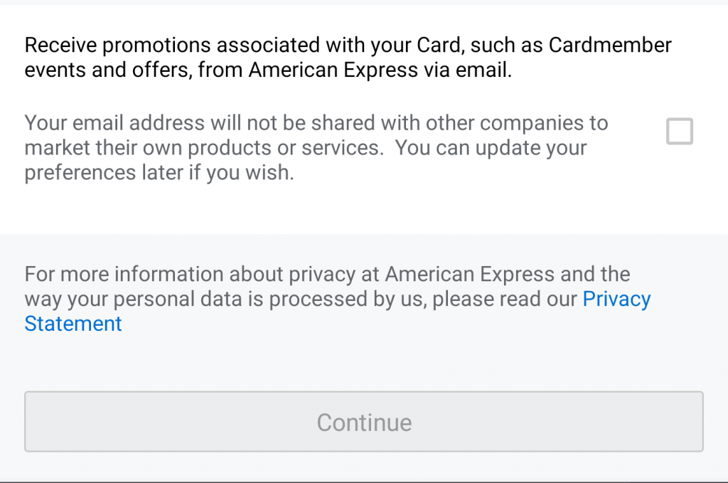
For the final example, this is how their marketing box looks like:

Notice how the promotions opt-in checkbox is next to the text saying:
"Your email address will not be shared with other companies to market their own products and services. You can update your preferences later if you wish."
This gives the impression that by checking the box, you agree to them not giving out your email address to other companies, while checking it opts you in, to receiving email promotions from American Express.
If you are designing a sign-up form for anything, please don't make me guess what I can put into the fields. It's a bad user experience that, with just a modicum of thought and testing, could be turned into a great experience.
 "/>
"/>